
5 key Elements That Increase Conversion On Website
With how much time people spend on the internet, it has become a must for brands to establish their online presence. Businesses owners are becoming aware that they need to be on top of search results, as well as the strategies they need to do to be able to reach that goal.
Sign up to get FREE CRM Trial
Whether you’re a small corporation on the rise, or a small online shop owner, building your brand through your website helps expose your business to a broader audience. However, even having said that, there is more to running a website than just driving traffic to it. But the trick is to convert them – and you can do a lot to improve your conversion rates.
But the problem is how do you convert your audience into customers? How do you identify if your website is quality enough to generate, not just thousands of views but, thousands of returning visits and eventually turning to sales?
Here are a few key website design elements you need to tune-up if you’re looking to boost conversions:
1. Simplify your Navigation:
Your website navigation has total power to direct your visitors wherever they want. It’s important to always provide clickable options that customers can quickly and easily understand, and avoid guesswork or confusion. Navigation is a huge component of driving conversions.
In a case study exposing the primary navigation items led to a big increase in engagement on mobile devices, and increased traffic to key pages. Those items that you include in your menu bar can make or break a visitor’s experience on your site. They’re also a great way to make it really clear exactly what your business offer.
For example, if your website sells products online you should display as many product categories directly in the main navigation, instead of putting in a “shop” dropdown menu. If you have key services, promote them to the main navigation and give them as much exposure as possible, as they are likely to be directly recognizable to your target audience.
This is a key website design element that you can optimize specifically for the purpose of increased conversions.
Try to narrow your navigation down to just a few options, and make sure that at least one of those options leads to a contact page or a click to call link.
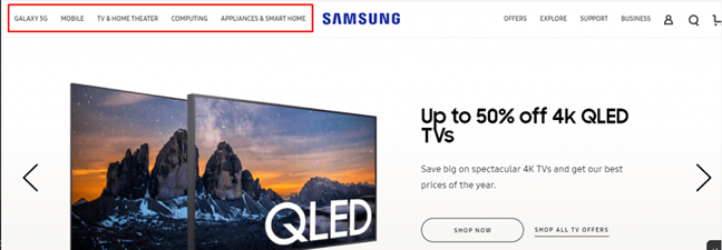
Samsung’s website is an example of clean and simple navigation. Keeping your navigation organized and straightforward will help more people find the information they need and keep them on your site longer.
2. Responsive Design:
If you want to know how to increase conversion rate, build a responsive design friendly website. Responsive design is one of the most basic needs of any website.
Sixty-seven percent of users are more likely from a mobile. When you combine that stat with the fact that over 40% of online activities on a website happen on mobile, you can see how vital a mobile-friendly site is to earn conversions.
If your website isn’t designed for those viewers, you’re missing out on a huge portion of qualified leads who could be converting.
Don’t have a mobile-friendly site? Here are a few ways to improve your site’s mobile-friendliness:
- Integrate responsive design:
Responsive design ensures your website adapts to whatever device a user uses. When you use responsive design, your site will fit beautifully to any screen in any size of mobile and provide a better experience.
- Make your site thumb-friendly:
When users browse on mobile devices, they use their thumb to navigate content and visit different pages. To make your site thumb-friendly, use bigger buttons, and place navigational items within the thumb’s reach.
- Use larger font sizes:
When people read information from your site on a mobile device, the font must be big enough to read. Don’t use small font sizes, as your audience will struggle to read the information. You can test different font sizes to see what works best.
These are just a few best practices you can follow to make your site mobile-friendly.
By making your site mobile-friendly, you’ll keep leads on your website and make them more likely to convert.
3. Content Layout:
Marketers seeking to dominate their respective niches should be focused on the best website layouts. Doing so improves your users’ experience and generates conversions. Design helps out with this A TON. Content layout is a website design element you just can’t overlook.
For instance, if you look at other sites in your niche, you’ll probably notice the logo featured in the top left-hand corner, and the information above the fold is usually designed in an “F” pattern, which follows the natural direction of human eyesight and attention.
The best layouts are instead shaped down to only those basic and ultra-important elements that are necessary for convincing prospects that you’re worthy of their time and money.
- Goal-Oriented:
The ideal website layout is symmetrical, clear, and orderly. Most importantly, top layouts make it clear what’s expected of visitors once they land. You can do this with negative space and prominent calls-to-action that can’t be missed.
- Designed for Skimmers:
When it comes to collecting and absorbing information, layouts that make text and other elements easy to consume tend to perform best.
These are qualities that every internet user wants. Study after study has shown that headlines, bold headers, and maybe a few paragraphs get serious attention from the average web browser.
4. A Strong Call to Action:
When you have the right call to action (CTA) buttons on your site, you will increase website conversions. CTA buttons play a fundamental role in guiding users to the next step. They tell your audience how to proceed and what they can expect to happen next.
A good CTA button pops off the page.
Your audience should have zero problems locating a button on your page. Choose a color that stands out from your website’s design and is easy for your audience to locate.

Using active language instead of generic, passive language on buttons can greatly improve engagement rates, and lead to more sales and conversions. For example:
- Change “Read more” to “View product details”
- “Store Finder” to “Where to buy”
- “Product categories” to “Discover more products”
- Avoid using generic words like “Submit’ or “Send” – try “Send my message”
By giving your user a snippet of what to expect when they click, they’re more likely to interact with a button. This encourages site owners to avoid generic calls to action and making CTAs more descriptive.
5. Add Testimonials, Reviews:
Testimonials are reviews and comments from happy customers about your product and/or service. They help with website conversion because they assure visitors that your brand is worth their time and money.
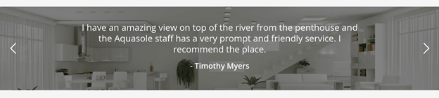
You want your site visitors to be confident in your brand and product/service and that’s why you should use first-hand customer experience. It’s just natural for consumers to trust other consumers’ opinions.
Testimonials are great for website conversion because they are straight evidence of your credibility and value. It also allows you to pitch your product or service discretely to your potential clients.
You should always make sure that your testimonials reflect your buyer persona. Be creative with your testimonials and use images, a video, audio, or creative text.
You can put them on your homepage, contact page, case studies page, or even create a page dedicated only to testimonials. Do what works best for your audience and place them appropriately to increase website conversion. You can also use reviews from Google, Facebook, or any other social platform that allows feedback.
Conclusion:
Although all these design principles might seem familiar, the results you can achieve by following them can give a massive boost to the conversion rate of your website. If you need help with your Conversion Rate Optimization (CRO) don’t hesitate to Contact us.
Subscribe to our Newsletter!
Get the Latest Global Vision Technology Updates.